Blog Post 0 - Data Visualization of the Palmer Penguins Data Set
In this post, I’ll construct some interesting data visualization of the Palmer Penguins data set.
The Palmer Penguins data set was collected by Dr. Kristen Gorman and the Palmer Station, Antarctica LTER, a member of the Long Term Ecological Research Network. Download the CSV data. It contains measurements on three penguin species: Chinstrap, Gentoo, and Adelie.

Exploring and Understanding Data
I will import the required Python modules at begining for convenience.
import pandas as pd
from matplotlib import pyplot as plt
import seaborn as sns
It’s essential to understand the data we have. In this section, I will explore the penguin dataset to help me decide what information is helpful. Then I will decide to construct which data visualization for the Palmer Penguins data set.
I will then run the next cell to import the penguin dataset as a pandas DataFrame called penguins.
Once I have read the penguins dataset into a pandas dataframe, we can take a look at the first five rows of the dataset using penguins.head().
url = "https://raw.githubusercontent.com/PhilChodrow/PIC16B/master/datasets/palmer_penguins.csv"
penguins = pd.read_csv(url)
penguins.head()
| studyName | Sample Number | Species | Region | Island | Stage | Individual ID | Clutch Completion | Date Egg | Culmen Length (mm) | Culmen Depth (mm) | Flipper Length (mm) | Body Mass (g) | Sex | Delta 15 N (o/oo) | Delta 13 C (o/oo) | Comments | |
|---|---|---|---|---|---|---|---|---|---|---|---|---|---|---|---|---|---|
| 0 | PAL0708 | 1 | Adelie Penguin (Pygoscelis adeliae) | Anvers | Torgersen | Adult, 1 Egg Stage | N1A1 | Yes | 11/11/07 | 39.1 | 18.7 | 181.0 | 3750.0 | MALE | NaN | NaN | Not enough blood for isotopes. |
| 1 | PAL0708 | 2 | Adelie Penguin (Pygoscelis adeliae) | Anvers | Torgersen | Adult, 1 Egg Stage | N1A2 | Yes | 11/11/07 | 39.5 | 17.4 | 186.0 | 3800.0 | FEMALE | 8.94956 | -24.69454 | NaN |
| 2 | PAL0708 | 3 | Adelie Penguin (Pygoscelis adeliae) | Anvers | Torgersen | Adult, 1 Egg Stage | N2A1 | Yes | 11/16/07 | 40.3 | 18.0 | 195.0 | 3250.0 | FEMALE | 8.36821 | -25.33302 | NaN |
| 3 | PAL0708 | 4 | Adelie Penguin (Pygoscelis adeliae) | Anvers | Torgersen | Adult, 1 Egg Stage | N2A2 | Yes | 11/16/07 | NaN | NaN | NaN | NaN | NaN | NaN | NaN | Adult not sampled. |
| 4 | PAL0708 | 5 | Adelie Penguin (Pygoscelis adeliae) | Anvers | Torgersen | Adult, 1 Egg Stage | N3A1 | Yes | 11/16/07 | 36.7 | 19.3 | 193.0 | 3450.0 | FEMALE | 8.76651 | -25.32426 | NaN |
The data set contains 17 columns, and some important column heading variables have the following meanings:
Species: Three penguin species (Adelie, Chinstrap, Gentoo).Island: Three islands (Torgersen, Biscoe, Dream).Date Egg: The date penguin was born.Culmen Length (mm): penguin’s culmen length (mm).Culmen Depth (mm): penguin’s culmen depth (mm).Flipper Length (mm): penguin’s flipper length (mm).Body Mass (g): penguin’s body mass (g).Sex: penguin’s sex.Delta 15 N (o/oo): measures of nitrogen in the penguin’s bloodstreams.Delta 13 C (o/oo): measures of carbon isotopes in the penguin’s bloodstreams.

Next, I will use the function df.nunique(), which counts the number of distinct elements in all columns without counting Nan values. Knowing how many unique values each column has can help me decide which columns I will drop later.
penguins.nunique()
    studyName                3
    Sample Number          152
    Species                  3
    Region                   1
    Island                   3
    Stage                    1
    Individual ID          190
    Clutch Completion        2
    Date Egg                50
    Culmen Length (mm)     164
    Culmen Depth (mm)       80
    Flipper Length (mm)     55
    Body Mass (g)           94
    Sex                      3
    Delta 15 N (o/oo)      330
    Delta 13 C (o/oo)      331
    Comments                 7
    dtype: int64
From above, I notice that all penguins are from the same Region and have the same Stage status. I will drop these two columns as it’s not valuable for my visualization. Also, I noticed that there are three different types of sex, which is a little bit strange.
In the next cell, I will check what another type of sex besides Male and Female is.
penguins["Sex"].unique()
array(['MALE', 'FEMALE', nan, '.'], dtype=object)
In the next cell, we can find which rows are having sex of .
penguins.index[penguins["Sex"] == "."].tolist()
[336]
Next, I will use df.isna() to pick out all nan values from data, then use df.sum() to find how many nan values are in each column and save the result in nan_values_summary.
nan_values_summary = penguins.isna().sum()
nan_values_summary
    studyName                0
    Sample Number            0
    Species                  0
    Region                   0
    Island                   0
    Stage                    0
    Individual ID            0
    Clutch Completion        0
    Date Egg                 0
    Culmen Length (mm)       2
    Culmen Depth (mm)        2
    Flipper Length (mm)      2
    Body Mass (g)            2
    Sex                     10
    Delta 15 N (o/oo)       14
    Delta 13 C (o/oo)       13
    Comments               318
    dtype: int64
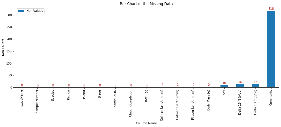
From the above summary, we notice many missing data in the Comments. I should consider dropping this row. There are more than ten missing data in Delta 15 N (o/oo) 4 and Delta 13 C (o/oo) 13. I might drop these two if I decided not to use these data in my visualization.
We can also create a bar plot for nan values by using matplotlib to understand the number of missing data.
fig, ax = plt.subplots(1)
# create the bar plot
ax = nan_values_summary.plot.bar(figsize=(16,5))
x.set(xlabel = "Column Name",
       ylabel = "Nan Counts",
       title = "Bar Chart of the Missing Data")

ax.legend(labels = ['Nan Values'],
          bbox_to_anchor = (0.12, 1))

# remove border
ax.spines['right'].set_visible(False)
ax.spines['top'].set_visible(False)

# I find how to add annotate on each bar online from
# https://www.geeksforgeeks.org/how-to-annotate-bars-in-barplot-with-matplotlib-in-python/
# Iterrating over the bars one-by-one
for bar in ax.patches:

  # Using Matplotlib's annotate function and
  # passing the coordinates where the annotation shall be done
  # x-coordinate: bar.get_x() + bar.get_width() / 2
  # y-coordinate: bar.get_height()
  # free space to be left to make graph pleasing: (0, 8)
  # ha and va stand for the horizontal and vertical alignment
    ax.annotate(bar.get_height(),
               (bar.get_x() + bar.get_width() / 2 ,
                bar.get_height()), ha='center', va='center',
                size=10,
                xytext=(0, 6),
                textcoords='offset points',
                color="firebrick")

Making the Plot
In this section I will create some fun interesting data visualization of the Palmer Penguins data set.
For fun, I will pick Date Egg and check how Date Egg associates with Body Mass (g) or Culmen Length (mm).
Cleaning Data
Before making plots, I should clean my data set.
First, I will drop the columns Region, Stage, and the columns which are not helpful in my visualization such has studyName, Sample Number, Individual ID, and Comments.
I don’t think I will use Delta 15 N (o/oo), Delta 13 C (o/oo), and Clutch Completion so I will remove these three columns too.
Then I will save all these column names in the list drop_list.
# Drop columns
drop_list = ["Region", "Stage", "studyName", "Sample Number", "Individual ID", "Comments","Delta 15 N (o/oo)", "Delta 13 C (o/oo)", "Clutch Completion"]
Next, I will write the function clean_penguins_data() to shorten the species name, drop the rows with sex ., and drop the columns in the drop_list. The function clean_penguins_data() accepts two arguments data_df (the data frame to be cleaned) and drop_list (a list of column names I will drop from the data frame).
def clean_penguins_data(data_df, drop_list):
    """
    This function will shorten the name of the Penguin Species,
    drop unuseful columns, and clean the missing (nan) values.

    Parameters:
    data_df: data frame to be cleaned
    drop_list: a list of column names I will drop from the input data frame

    Return:
    A cleaned dataframe df.
    """

    df = data_df.copy() # avoid polluting original data set

    # Shorten the species name
    df["Species"] = df["Species"].str.split().str.get(0)

    # Remove the entries where sex was not recorded
    df = df[penguins["Sex"] != "."]

    #Drop columns
    df = df.drop(drop_list, axis = 1)

    #Find and drop the rows with nan values
    nan_df = df.isna()
    nan_columns = nan_df.any()
    columns_with_nan = df.columns[nan_columns].tolist()
    df = df.dropna(subset = columns_with_nan)

    return df
Let’s check the cleaned data set.
df = clean_penguins_data(data_df = penguins, drop_list = drop_list)
df
| Species | Island | Date Egg | Culmen Length (mm) | Culmen Depth (mm) | Flipper Length (mm) | Body Mass (g) | Sex | |
|---|---|---|---|---|---|---|---|---|
| 0 | Adelie | Torgersen | 11/11/07 | 39.1 | 18.7 | 181.0 | 3750.0 | MALE |
| 1 | Adelie | Torgersen | 11/11/07 | 39.5 | 17.4 | 186.0 | 3800.0 | FEMALE |
| 2 | Adelie | Torgersen | 11/16/07 | 40.3 | 18.0 | 195.0 | 3250.0 | FEMALE |
| 4 | Adelie | Torgersen | 11/16/07 | 36.7 | 19.3 | 193.0 | 3450.0 | FEMALE |
| 5 | Adelie | Torgersen | 11/16/07 | 39.3 | 20.6 | 190.0 | 3650.0 | MALE |
| ... | ... | ... | ... | ... | ... | ... | ... | ... |
| 338 | Gentoo | Biscoe | 12/1/09 | 47.2 | 13.7 | 214.0 | 4925.0 | FEMALE |
| 340 | Gentoo | Biscoe | 11/22/09 | 46.8 | 14.3 | 215.0 | 4850.0 | FEMALE |
| 341 | Gentoo | Biscoe | 11/22/09 | 50.4 | 15.7 | 222.0 | 5750.0 | MALE |
| 342 | Gentoo | Biscoe | 11/22/09 | 45.2 | 14.8 | 212.0 | 5200.0 | FEMALE |
| 343 | Gentoo | Biscoe | 11/22/09 | 49.9 | 16.1 | 213.0 | 5400.0 | MALE |
333 rows × 8 columns
Preparing Data
I will only keep Species, Island, Date Egg, Body Mass (g) in my dataset df for convenience.
Next, I will change the values in Date Egg to the datetime column that reflects year, month, and day (YYYY-MM-DD). We can convert the values to DateTime using the built-in pandas function pd.to_datetime(). The nice thing about this function is that it can automatically detect several common formats of date-time string. Then we can use Series.dt.year to get the year of the datetime and save it in the new column year.
We can also sort the value based on the time of the Date Egg by using df.sort_values().
df["Date Egg"] = pd.to_datetime(df["Date Egg"])
df['year'] = df['Date Egg'].dt.year
df = df.sort_values(by=["Date Egg"])
df
| Species | Island | Date Egg | Culmen Length (mm) | Culmen Depth (mm) | Flipper Length (mm) | Body Mass (g) | Sex | year | |
|---|---|---|---|---|---|---|---|---|---|
| 33 | Adelie | Dream | 2007-11-09 | 40.9 | 18.9 | 184.0 | 3900.0 | MALE | 2007 |
| 32 | Adelie | Dream | 2007-11-09 | 39.5 | 17.8 | 188.0 | 3300.0 | FEMALE | 2007 |
| 31 | Adelie | Dream | 2007-11-09 | 37.2 | 18.1 | 178.0 | 3900.0 | MALE | 2007 |
| 30 | Adelie | Dream | 2007-11-09 | 39.5 | 16.7 | 178.0 | 3250.0 | FEMALE | 2007 |
| 29 | Adelie | Biscoe | 2007-11-10 | 40.5 | 18.9 | 180.0 | 3950.0 | MALE | 2007 |
| ... | ... | ... | ... | ... | ... | ... | ... | ... | ... |
| 325 | Gentoo | Biscoe | 2009-12-01 | 46.8 | 16.1 | 215.0 | 5500.0 | MALE | 2009 |
| 337 | Gentoo | Biscoe | 2009-12-01 | 48.8 | 16.2 | 222.0 | 6000.0 | MALE | 2009 |
| 338 | Gentoo | Biscoe | 2009-12-01 | 47.2 | 13.7 | 214.0 | 4925.0 | FEMALE | 2009 |
| 313 | Gentoo | Biscoe | 2009-12-01 | 49.5 | 16.1 | 224.0 | 5650.0 | MALE | 2009 |
| 312 | Gentoo | Biscoe | 2009-12-01 | 45.5 | 14.5 | 212.0 | 4750.0 | FEMALE | 2009 |
333 rows × 9 columns
Plotting
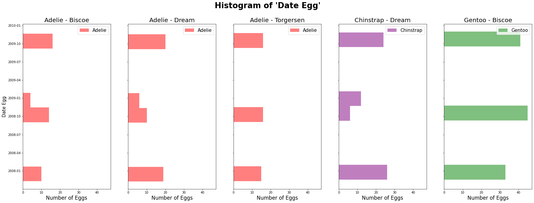
First, we can create a histogram to count each day’s Date Egg by using matplotlib.
# colour map for species
species_mapper = {
    "Adelie" : "red",
    "Gentoo" : "green",
    "Chinstrap":"purple"
}

# create the 5 plots, for different species from different islands.
fig, axes = plt.subplots(1, 5, figsize = (30,10), sharey = True, sharex = True)
axes[0].set_ylabel("Date Egg", fontsize = 15)
ax_list = axes.tolist()                       # get the list of axes

def plot_hist(df, colname, alpha):
    """
    This function is used in the apply() method;
    it helps draw the histogram of "Date Egg" for each species.

    Parameters
    ----------
    df: data frame;
    colname: string; "Date Egg" column
    alpha: float; a user-specified number for transparency

    Return
    ----------
    No return value
    """

    specie_name = df["Species"].unique()[0]   # get species Island name
    island_name = df["Island"].unique()[0]    # get current Island name
    ax = ax_list.pop(0)                       # get an axis
    # set title name for each plot
    ax.set_title(specie_name + " - " + island_name, fontsize = 20)
    ax.hist(df[colname],
            alpha = alpha,
            label = specie_name,
            color = species_mapper[specie_name],
            orientation ='horizontal')
    ax.set_xlabel('Number of Eggs', size=17)
    ax.legend(fontsize = 15)

# groupby method with apply
df.groupby(["Species", "Island"]).apply(plot_hist, "Date Egg", 0.5 )

# add a suptitle to the figure.
fig.suptitle("Histogram of 'Date Egg' ",
             fontweight ="bold", size=26)
# show the plot
plt.show()

We can see that the majority of Penguins were born in November.
We can only create the scatterplot of Date Egg against Body Mass (g) on each Island by using seaborn.
fgrid = sns.relplot(data=df,
                    x = "Date Egg",
                    y = "Body Mass (g)",
                    hue = "Species",
                    col = "Island")

fgrid.fig.suptitle("Scatterplot of 'Date Egg' Against 'Body Mass (g)' ", size=16)
fgrid.fig.subplots_adjust(top = 0.85)
# turn 2D into 1d, easier to iterate
axes = fgrid.axes.flatten()
# rotate xticks for each plot
for ax in axes:
    ax.tick_params(axis="x", labelsize=10, labelrotation=40, labelcolor="firebrick")

From above, I wonder why all penguins from the data set only have November and December as their date of Date Egg.
If we want to know the scatterplot of Date Egg against Body Mass (g) for each species with different sex on each Island, we can use Interactive data graphics from plotly.
Plotly includes a very large catalog of interesting plotting capabilities. The Plotly Express module allows us to create several of the most important kinds of plots using convenient, high-level functions.
We also can change plot appearance themes by using plotly.io
We also can use facetting to creating multiple, small plots, each of which display a subset of the data. Plotly supports the easy creation of facets using the facet_col and facet_row arguments.
Because these contents are from PIC 16B, I will import the corresponding modules here instead of at the beginning of this blog.
from plotly import express as px
import plotly.io as pio

# pio.templates.default = "ggplot2"

pio.templates.default = "plotly_white"

fig = px.scatter(data_frame = df,      # data set
                 x = "Date Egg",       # column for x axis
                 y = "Body Mass (g)",  # column for y axis
                 color = "Species",    # column for dot color
                 width = 900,          # width of figure
                 height = 700,         # height of figure
                 opacity = 0.6,        # transparency for dot
                 facet_col = "Sex",    # assign marks to facetted subplots in the horizontal direction.
                 facet_row = "Island", # assign marks to facetted subplots in the vertical direction.
                 title = "Scatterplot of 'Date Egg' Against 'Body Mass (g)' ")  # make a title

# make title centered
fig.update(layout=dict(title=dict(x=0.5)))
# reduce whitespace
fig.update_layout(margin={"r":0,"t":50,"l":0,"b":0})
# show the plot
fig.show()
